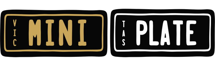

Match Plate Font Styles for Kids’ Rides
A custom mini plate can turn a plain ride-on car into your child’s favourite set of wheels. But before you choose a name, nickname or cheeky little message, it helps to think about match plate font styles. The right lettering makes the plate easy to read, suits the vehicle or space, and gives the finished look that extra bit of personality.
For most families, the best choice is not the fanciest font. It is the one that looks great from a few steps away, feels right for the child and works with the plate colour, theme and use. A bold style might be perfect on a little off-road ute, while a softer look can suit a bedroom door or pet shelter beautifully.
Why font choice changes the whole look
The same wording can feel completely different depending on the font. Put “MIA’S RIDE” in a strong, block-style typeface and it has a classic number-plate feel. Choose a rounded or playful style and the same plate becomes warmer and more whimsical.
This matters because mini plates are usually seen in motion, from across the backyard or during busy playtime. Clear lettering helps friends, grandparents and little siblings spot whose scooter, bike or cubby house it is straight away. It also makes the personalised detail feel intentional rather than crowded.
A good font creates a balance between fun and readability. Kids may love an elaborate design, but very thin strokes, tightly packed letters or overly decorative shapes can be harder to read on a smaller plate. If the name is long, simplicity becomes even more valuable.
Match plate font styles to the item
The easiest way to choose is to start with where the plate will go. Think of the plate as the finishing touch, not a separate accessory. Its font should complement the personality of the item.
Ride-on cars and electric vehicles
Ride-on cars tend to look best with confident, easy-to-read lettering. A bold, traditional number-plate style suits everything from mini 4WDs and sporty cars to little construction vehicles. It adds that realistic detail children love when they are pretending to head off on a big adventure.
For a tough-looking ride, short names and strong letter shapes work particularly well. “JACK”, “LIL UTE” or a family-inspired nickname will usually look sharper than a long phrase. If you are choosing colours to match the vehicle, make sure there is enough contrast between the font and background so the message does not disappear against the bodywork.
Bikes, scooters and balance bikes
On a bike or scooter, a clean font is often the winner because the plate itself may be smaller and viewed quickly as your child whizzes past. A simple name, initials or fun plate-style word gives the bike a special identity without making it look busy.
This is also a great place to match colours. A bright plate can pop against a neutral bike, while a classic plate colour can balance a colourful scooter covered in streamers, baskets and stickers. The font does not need to compete with every other detail - it just needs to hold its own.
Bedroom doors, cubby houses and play spaces
Indoor signs and cubby house plates give you more room to lean into a theme. A child with a race-car bedroom might enjoy the crisp look of a number-plate font, while a garden cubby could suit a friendlier, softer style. The best option depends on whether you want the sign to feel like a personalised label, a pretend street sign or part of a bigger play-world setup.
For shared rooms or family play areas, consider wording that can last. A plate featuring a surname, a cubby house name or a playful title may keep working as children grow, even when their favourite character or colour changes.
Pet shelters and family spaces
A personalised plate is not only for the kids. It can add a fun finishing touch to a dog kennel, pet corner, garage shelf or backyard play zone. Here, clear fonts are especially helpful: a pet name should be easy for everyone to recognise at a glance.
If the space already has lots going on, such as patterned cushions, painted walls or colourful toys, choose a classic plate style to keep the overall look tidy. If the background is simple, you can be more adventurous with colour and wording.
Keep the message easy to read
The font and the text need to work together. A short word gives you more flexibility, while a longer name benefits from a straightforward style and sensible spacing. Before ordering, say the plate text out loud and picture it on the actual item. Will it still be clear if someone sees it from the other side of the driveway?
Capital letters often create a crisp, authentic plate look, particularly for cars and scooters. Mixed case can feel softer and more personal for bedroom signs. Neither is automatically better. It depends on the theme, the available space and whether you are after a realistic vehicle detail or a decorative keepsake.
Try to avoid using too many ideas at once. A detailed font, a long phrase, bright colours and extra symbols can make a small plate feel crowded. Let one feature lead. If the wording is playful, keep the font clean. If the font has a distinct personality, use shorter text.
Choose contrast before chasing colour
Colour is part of the fun, especially when you are matching a favourite ride-on or bedroom theme. Still, contrast is what makes the lettering do its job. Dark text on a light background, or light text on a dark background, is generally easier to spot than colours with a similar depth.
Think about where the item lives, too. A plate on a scooter used outdoors may be seen in full sun, shade and late-afternoon light. A high-contrast combination stays clearer in all of those settings. A bedroom plate can be more subtle if the room lighting is consistent, but readability is still worth keeping in mind.
If you are buying a gift, a classic contrast combination is the safe choice. You can personalise the wording without needing to know every detail of the child’s décor or the exact shade of their ride-on.
Make the design feel personal, not complicated
The most memorable plates often have the simplest messages. A first name, nickname, birth year, family joke or pretend registration-style combination can make a child light up. It tells them that this bike, car or cubby is truly theirs.
For siblings, matching plate designs with different names can look fantastic and help avoid the usual “that’s mine” debate. Keep the same font and colour combination across each plate, then change the wording to suit each child. It creates a coordinated look without taking away their individuality.
You can also match a plate to an occasion. A birthday gift might feature a new nickname. A Christmas surprise could complete a ride-on car reveal. For a new bedroom or cubby house, the plate can be the small detail that makes the whole space feel finished.
A quick check before you customise
Before finalising your plate, check that the wording is spelled correctly, the chosen style suits the item, and the colour contrast will be clear. It is worth asking one simple question: will my child recognise this as theirs straight away? If the answer is yes, you are on the right track.
At MiniPlate, the fun is in making everyday play spaces feel a little more special - without making the design process hard work. Choose a look that fits the moment, keep the message clear, and let that small personalised plate become part of the memories made on every backyard lap and cubby house adventure.
For decorative mini plates, keep the design for play, home and personal spaces rather than treating it as a replacement for a road vehicle registration plate. Then all that is left is choosing the name that will make them grin when they first see it.